Special Projects
Developing location based onsite wastewater inventory
Special Projects, Bay County, MI - December.2019
Insights I - Visualizations
In the last post we talked about the benefits of base level insights that come from simply mapping onsite systems. These benefits have already made accessing onsite wastewater information more efficient, improved how information is organized and helped regulators in Bay County identify potential issues, such as properties where no permit is on file. In this post, we will start to explore some of the other tools in FetchEH that are designed for gaining insights.
Project Updates
Before we get started, here are a couple of updates regarding where we are with the mapping and software. As of mid-November, we have mapped about 6,400 onsite systems. Our mapping is now being complimented by Bay County staff as they started visiting sites within 500’ of the Kawkawlin River, starting at the mouth of the river and working upstream. The site visits focus on determining what is present at properties without a permit – more on this process in a later post. The important part here is that the mapping process now includes filling the inventory gaps - properties without a permit.
On the software updates side, we have enabled Insights for Bay County and our team to test out. Insights are a collection of tools in FetchEH that are designed to help regulators ask questions about their onsite wastewater inventory, including options for visualizing, querying, filtering and creating scoring routines to evaluate the inventory. We finally had time this fall to play around with the data and Insights, so it gives us the opportunity to show what the Insights are capable of with the growing inventory in Bay County. In this post we will start by looking at visualizing system characteristics.
Area of Interest
Using the Insights starts by defining an area of interest, which is the area on the map containing onsite systems that a specific Insights tool will be applied. For now, the area of interest can be the entire county or a custom area that is drawn on the map. Future updates will provide the option to use an existing geography, such as a watershed, township or soil type, as the area of interest, and let the user to create an area of interest using a buffer, such as the area within 100’ of a lake or stream. For the examples in this post, the area of interest is the entire county.
Visualizing System Characteristics
Visualizations are the simplest form of FetchEH Insights, but provide an efficient means of understanding the inventory from a broad perspective. Visualizations work by applying a single onsite system characteristic, such as the install date or tank capacity, to classify the onsite systems in the map. Behind the scenes, FetchEH recognizes the type of data that the user has selected to be classified, and then automatically applies the appropriate classification to the onsite systems in the area of interest.
Below are some examples of visualizing different system characteristics:
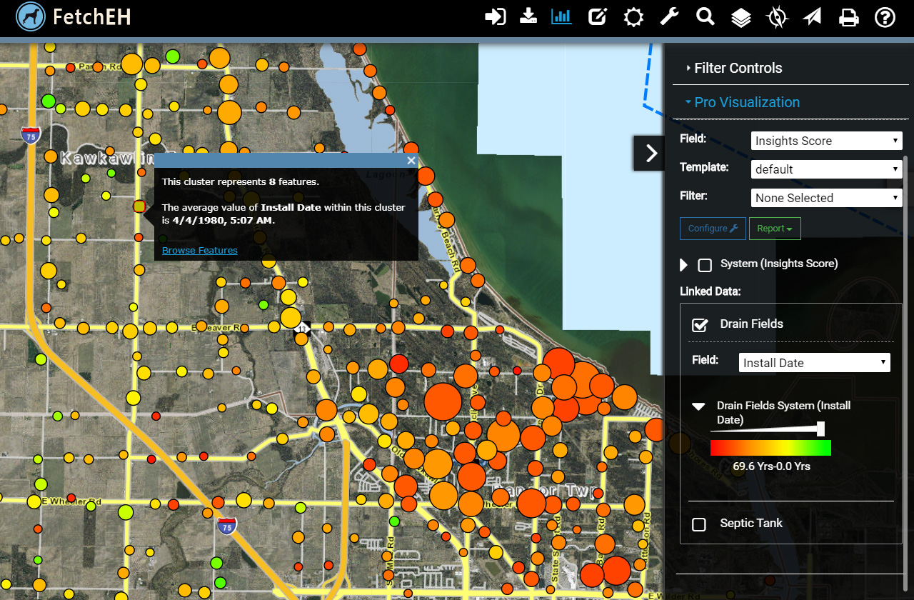
Visualizing Onsite Systems by Drain Field Install Date
Drain Field Age by Install Date: the first visualization provides the onsite system age using the install date of the drain field.
A couple of notes here. The smallest points represent a single onsite system, while the larger points represent a group, or cluster, of onsite systems. Clustering is a common method of managing visualizations at different map scales, so as a user zooms into the map they will see more detail, or less points that represent multiple onsite systems. Each cluster can be selected to view the average age, and each onsite system in a cluster can be browsed using the Information Window.
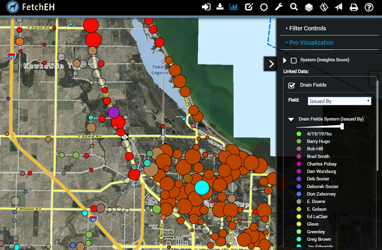
Visualizing Onsite Systems by Who Issued Permit
Who Issued a Permit: visualizations can be created dynamically for any data that has been entered for an onsite system, here, the person who issued a permit is displayed.
Note the date value that was entered at the top of the legend. This can later be located using a query and edited, so Insights will also be used to help scrub data once the mapping is completed.
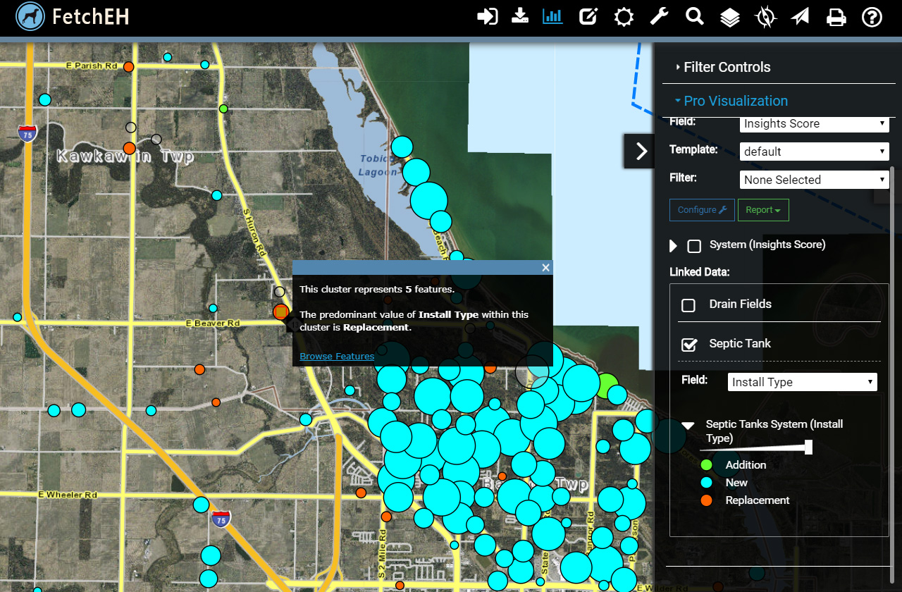
Visualizing Onsite Systems by Installation Type
Installation Type: here we are visualizing the type of installation for septic tanks.
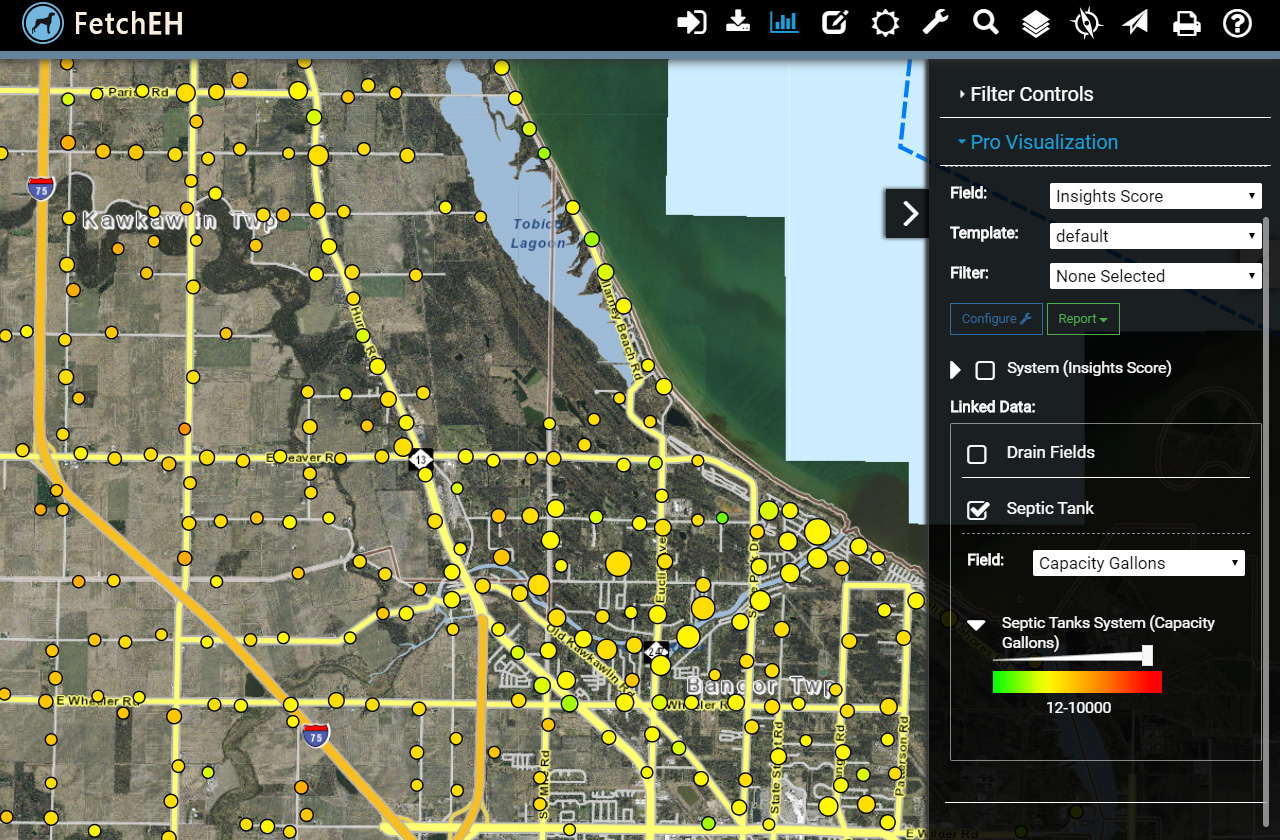
Visualizing Onsite Systems by Septic Tank Capacity
Tank Capacity: this visualization shows the septic tank capacity in gallons. Again, the low value of 12, and possibly the 10,000 on the high end, are likely a data entry errors and will be corrected when we scrub the data.
Visualizations are the simplest form of gaining insights about onsite systems in a specific area. While they don't provide the ability to ask complex questions like other Insights tools, visualizations do offer regulators an efficient means of understanding onsite characteristics from a broad perspective. So, even in this simple form, it would be impossible to achieve the same understanding from permits in a filing cabinet, or from permits managed in a database system. Visualizations are just one Insight that makes the location-based approach to managing onsite systems so powerful. We will explore more in the next post.